Kind Coffee
Kind Coffee explores how a sustainability-minded coffee company could connect quality coffee with a broader idea of kindness—to the people who drink it, the communities behind it, and the environment it depends on.
The challenge was not simply to create another natural-looking coffee brand. It was to build a brand system that could make purpose feel approachable rather than preachy, premium without becoming exclusive, and distinctive enough to work across both physical and digital experiences.
Coffee Brand / Shop
Kind Coffee
Brand Strategy
Naming
Visual Identity
Packaging
Digital Experience
Retail
Social
The Problem
Sustainability can be a meaningful reason to choose one coffee brand over another, but purpose-driven brands often fall into familiar territory: overly rustic aesthetics, heavy environmental messaging, or premium positioning that can make them feel niche.
For Kind Coffee, the opportunity was to create something more accessible—a brand that could appeal to customers who care about what they buy without asking sustainability to become their entire identity.
The Insight
People do not always want to make a statement with every purchase.
Sometimes they simply want a better option.
The target audience values quality, responsible choices, and brands that contribute to something beyond themselves, while still expecting the convenience and familiarity of an everyday coffee experience.
That led to a simple idea:
Make doing something good feel like the natural choice, not the difficult one.

The Strategy
Build the brand around kindness rather than sustainability alone.
The name Kind Coffee created a broader and more human platform for the brand.
“Kind” could represent care for:
People
An approachable experience built around everyday connection.
Product
Coffee for customers who appreciate quality from everyday brews through more specialized origins.
Planet
A brand philosophy centered on thoughtful sourcing and environmental responsibility.
Instead of building an identity that constantly needed to explain its values, the goal was to make those values felt throughout the experience.
Brand Positioning
Responsible, not preachy.
Natural, not rustic.
Quality-driven, not exclusive.
Friendly, optimistic, and human.
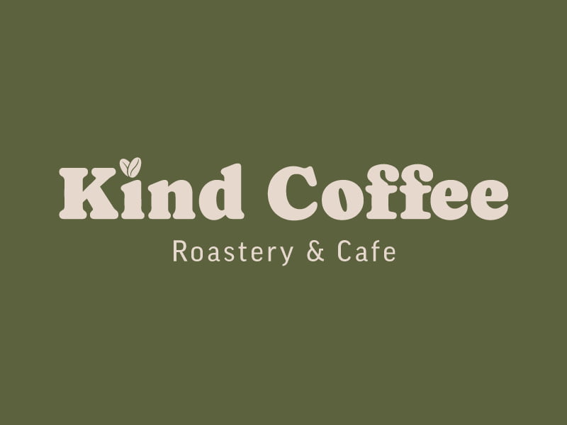
Kind Coffee offers quality brewed organic coffee from sustainable sources,
so that you can fulfill your coffee needs without worrying
about the impact on the environment and culture of the source.
The Creative Direction
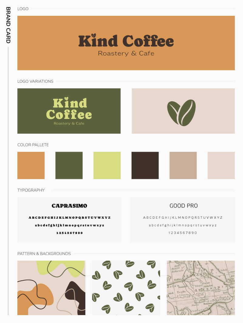
The visual identity translates those principles into a warm, flexible brand system.
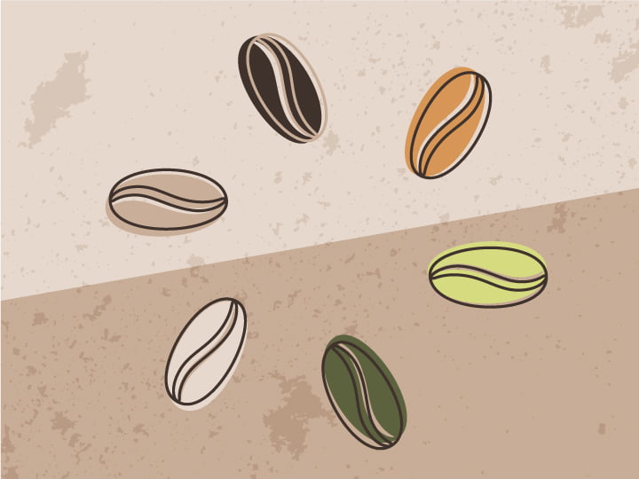
Rather than defaulting to the greens commonly associated with sustainable products, I developed a natural palette inspired by coffee itself—from the plant and fruit through roasting and preparation.
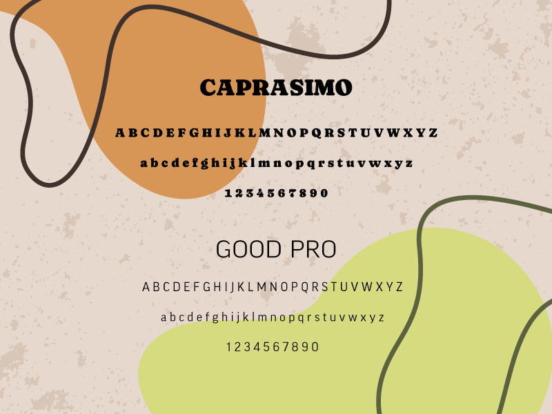
The identity combines simple forms, approachable typography, restrained natural textures, and lifestyle photography to create a brand that feels conscious without feeling institutional.
The system was designed to be recognizable beyond the logo, allowing color, type, imagery, messaging, and physical materials to reinforce the same personality across every touchpoint.
One Brand, Multiple Experiences
A useful brand system needs to work beyond an identity presentation.
I extended the direction across the places customers would actually encounter Kind Coffee, including:
Packaging
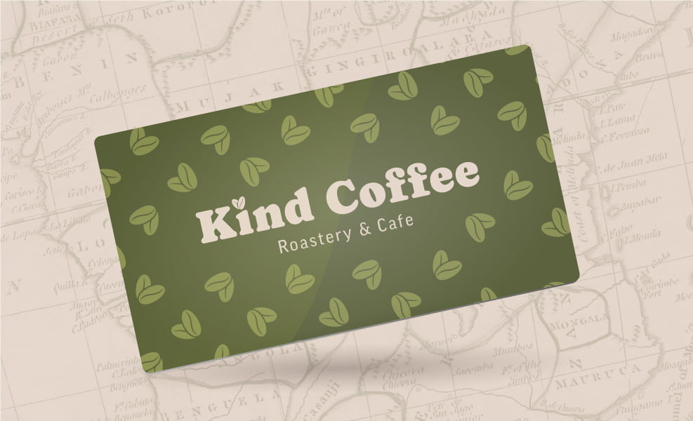
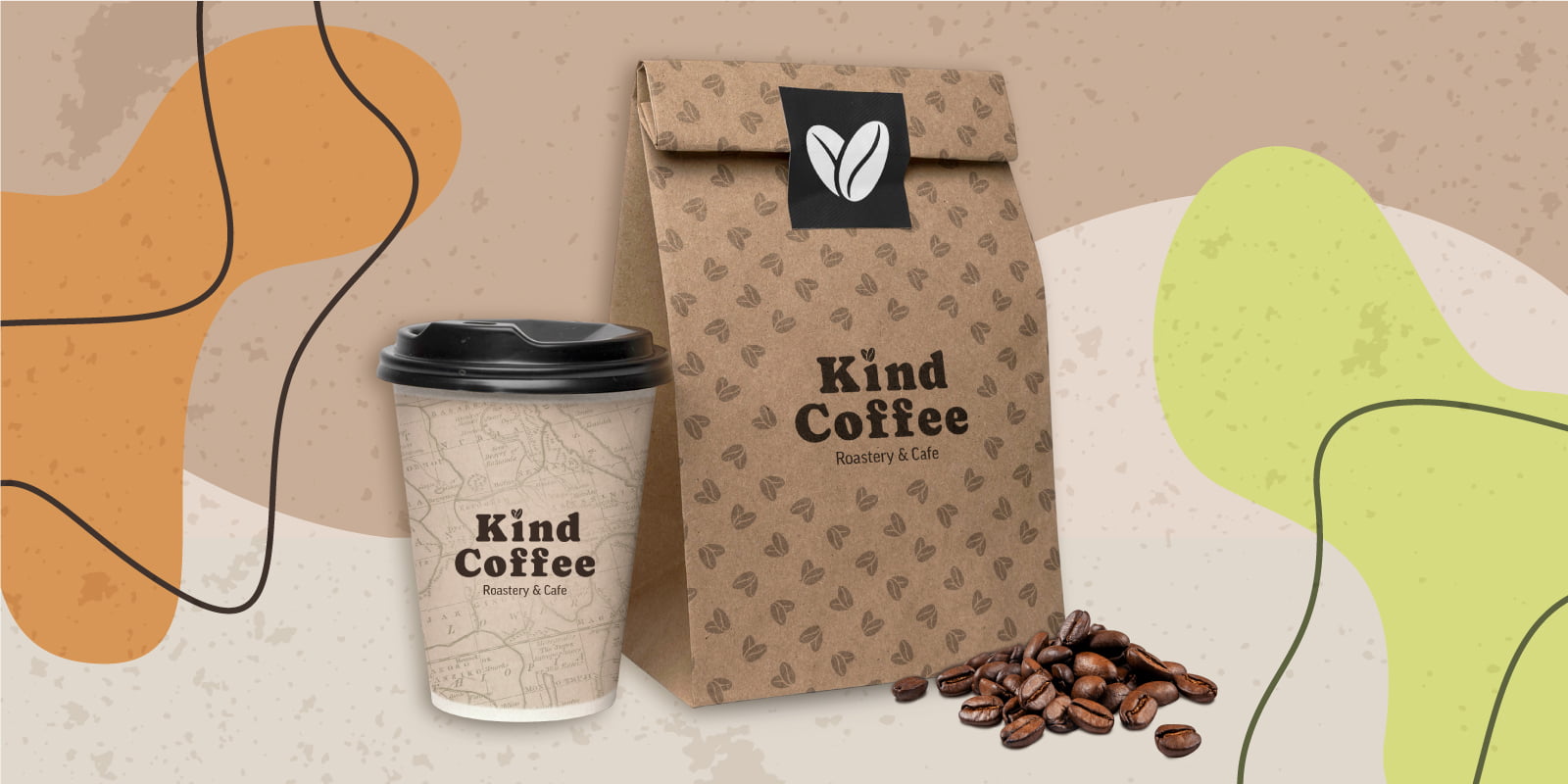
Packaging explores how the identity could organize products while maintaining enough consistency to build recognition across a larger coffee line.
Natural materials and a restrained visual language reinforce the brand’s responsible positioning without overwhelming the product itself.
Digital Experience
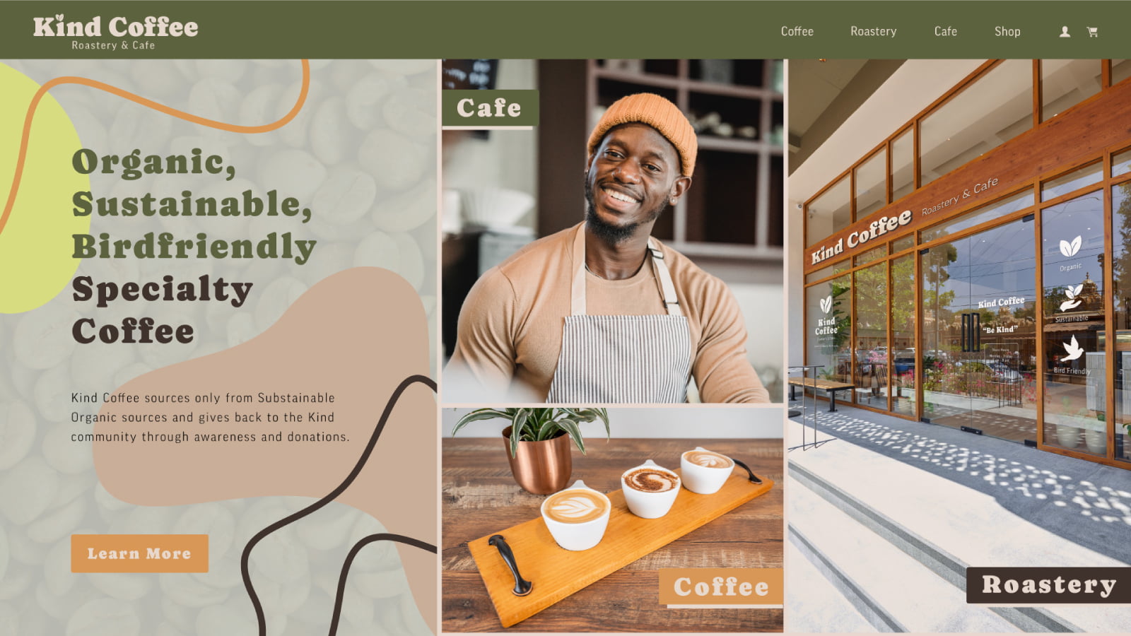
The website extends the physical identity into an ecommerce and brand experience designed around clarity, warmth, product discovery, and storytelling.
Desktop and mobile concepts establish how the visual system could remain consistent while adapting to different screen sizes and customer needs.
Social
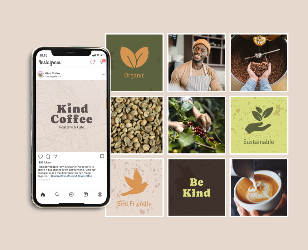
The social system creates a recognizable framework for product, lifestyle, educational, and brand content rather than relying on unrelated individual posts.
Physical Environment
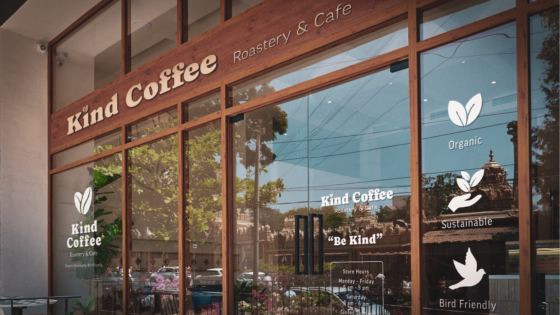
The storefront concept tests the identity at architectural scale.
Signage, color, materials, typography, and environmental applications were considered as parts of the same customer experience rather than separate design exercises.

vonWolf truly captured the essence of what our customers are drawn to.
They perfectly translated our vision into a captivating brand that resonates with our Kind customers.
Ready to work with us?
See More Work